*wearing an impossibly chic trenchcoat.
Zara’s website is not a website.
Zara’s website is a conceptual art installation about the futility of human desire. It is a maze, a riddle, a mood board created by someone who has never purchased clothing (at least with their own money) but has absolutely studied “vibes.”
It is the digital equivalent of an intimidatingly attractive person who refuses to make eye contact with you.
In theory, Zara is a fast-fashion retailer. In practice, their website behaves like an immersive avant-garde exhibition where the theme is: “You want pants? Prove it.” [I hope you read that in a Slavic supermodel accent, because I sure wrote it with that intention.]
Let’s begin.
1. Zara Rejects the Notion That You Came Here to Shop
Most websites have a basic premise:
You want a thing → You search for the thing → You find the thing → You buy the thing.
Zara’s premise is different:
You want a thing → You wander through a series of black-and-white vignettes set in abandoned industrial spaces → You click on a photo that looks like it belongs in a Scandinavian divorce drama → You discover it’s a skirt, maybe? → You scroll horizontally for no reason → You curse (in flawless Castilian Spanish) → You close the tab → You return, ashamed and feeling vaguely cachonda.
To shop at Zara online is to surrender control. Zara is not here to help. Zara is here to challenge.
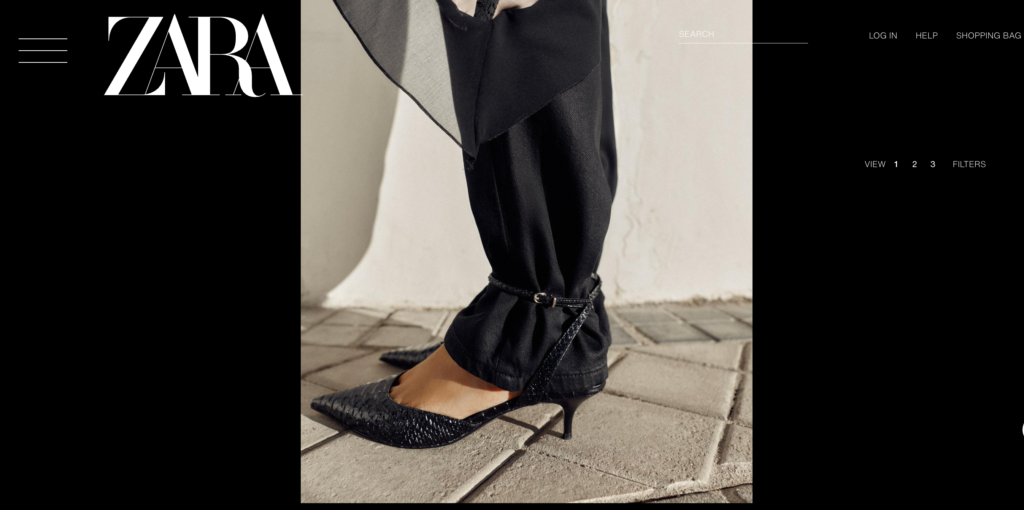
2. The Photos Are Stunning — and Completely Useless
Every Zara product image is a high-fashion editorial shot where the model is:
- Sitting behind a pillar
- Lying on a rooftop
- Standing in ankle-deep fog
- Wearing the shirt backwards
- Aggressively refusing to face the camera
- Partially obscured by furniture
- Lit like a neo-noir film
If you want to know what the garment actually looks like, your best bet is:
- Guessing
- Praying
- Checking TikTok hauls posted by 19-year-olds
Zara does not show us clothes. Zara shows moods. Zara asks us to behold a model wrapped in a cathedral-length train of linen, staring into the void, as if the void just told her the EU just banned espresso.
Meanwhile, you’re just trying to figure out: Is that a dress or a shirt? And is it navy, or… shadow-colored?
3. The User Interface Is a Personal Attack
Let’s address the UI, which appears to have been designed by:
- An absurdist poet who stumbled drunkenly into Zara’s corporate headquarters
- An intern-slash-sculpture MFA student who insists the website is their thesis project
- A veteran executive who partied with Warhol and Googled “what is UX” once, briefly, in 2013
Everything is white space.
Everything is floating.
Everything is mysterious.
Nothing is labeled.
Nothing behaves as you expect it might.
Nothing can be found twice.
Navigation menus collapse for no reason, like a fainting Victorian heroine. The search bar hides — truly hides, as if ashamed.
Want to see the next image?
Great. Click the right arrow.
But just so you know, the right arrow might also send you to a live feed of the dressing room in Zara’s latest pop-up shop, housed in a repurposed school bus that’s parked behind a Mexican taqueria in Berlin.
Or that arrow might close the window entirely.
Zara’s website is like Chat Roulette with a better haircut.
4. Zara Does Not Want You to Know Things in Advance
On Zara’s website, knowledge is withheld with intention. You will not know:
- The fabric composition (although it will inevitably be synthetic)
- The fit
- The silhouette
- The back view
- The side view
- The front view (often)
- The model’s height
- Whether the shirt is sold out until you try to buy it
- Whether that “co-ord” piece actually has a matching partner…
- or if it is a conceptual art piece about corduroy
Zara says: “These practicalities are beneath you.”
Which is literally what opening a Zara package is like: a blindfolded trust fall onto a pile of rayon.
5. Everything Is Sold Out, Including the Website’s Will to Live
You will click on a pair of shoes. (A pair of fur-lined mary jane mules, perhaps.) You will feel a spark of joy. You will say, softly, “Cute.” You will try to add them to your cart.
Zara will respond:
“Unfortunately, this item is unavailable.”
Which is Zara code for: “We sold five units of this dress in Portugal, and now it’s gone forever. Try again next week when we upload a new batch of cryptic editorial images.”
You begin to suspect Zara is not selling clothes.
Zara is selling hope.
Or is it existential dread?
I don’t know, ask the intern.
6. Zara’s TOXIC TRAIT: MAKING You Feel Unworthy of the Clothes
Shopping at Zara online is not a commercial transaction. It is an audition.
You do not simply buy a blazer. You must:
- Decode a surrealist photograph
- Divine the garment’s shape
- Determine if you have the spiritual fortitude to pull it off
- Locate the microscopic “add to cart” button
- Complete a checkout flow designed by an anti-Capitalist agitator
- Wait 17 days for shipping
- Try it on — and only then realize it is made of Tyvex, not gabardine
- Declare defeat
Zara understands that craving fashion is a psychological vulnerability and exploits it beautifully.
7. The App Is Somehow Worse
In case you were wondering, Zara’s app is a full sensory experience of frustration.
The tap zones are microscopic. The pages behave like a puzzle you don’t remember agreeing to solve. Sometimes, it simply refuses to scroll, as if to say, You’ve had enough.
Zara’s app gives strong “haunted museum” energy. You open it, wander briefly, panic, and leave.
8. And Yet—We Return
Because here’s the real issue:
Zara knows the clothes are chic.
Zara knows the styling is hypnotic.
Zara knows the price point hovers at that exact intersection of “affordable-ish” and “aspirational.”
Zara also knows the website is annoying, the app is a gauntlet, and the product photography reveals absolutely nothing.
They don’t care, because they know you’ll come back. (That geometric-print Marni-inspired shift dress blip-crawls through your dreams like Tetris blocks.)
If Zara’s website was a person, they would describe themselves as fashion-forward and mysterious; serving lewks, not clarity.
Zara’s e-commerce MO is to create desire and then make it difficult. That difficulty reinforces desire. It’s practically erotic.
9. WE ARE POWERLESS TO RESIST…
Zara’s website is a triumph of aesthetics over usability, design over logic, and vibes over actual shopping. It is fashion’s version of a riddle wrapped in a mystery wrapped in a grainy photo of a braless model wearing a gossamer sweater (or is it a mosquito net?) and an accusatory expression.
Is it frustrating? Yes.
Is it dysfunctional? Absolutely.
Is it iconic? Dear god, yes.
10. AND ZARA KNOWS IT
Because the truth is, Zara’s website isn’t broken.
It’s intentional. It’s a digital fever dream that smells like a boutique hotel lobby.
Is it any wonder we keep hitting the snooze button?