There’s a peculiar moment that happens when you open a new direct-to-consumer website. A faint déjà vu drifts in: the clean sans-serif font, the soothing beige palette, the strategically casual photography of a person in linen doing something gently aspirational, like slicing a pear or sitting on a sun-warmed concrete step. The product could be anything. A water bottle. A bra. A weighted blanket. A probiotic formulated by monks in an Alpine grotto. You could swap in almost any logo and the page would remain essentially unchanged.
It’s not just websites. Walk into a café in any American city and you’ll recognize the furniture from three Instagram accounts you follow. The same matte black pendant lights. The same fiddle-leaf fig fighting for its life in a corner. The same chalkboard lettering that whispers artisanal sincerity. It’s uncanny, a little spooky, like all our aesthetics were pressed from the same design waffle iron.
We’re living in the golden age of Sameness, a worldwide creative convergence I’ve started calling the Great Beige Merge. The causes are many: market forces, minimalism’s long tail, venture-backed brand kits, and the gravitational pull of algorithms. But the effect is simple. Things look the same because, increasingly, they are shaped by the same hands.
Defaults Are Destiny
Let’s start with the obvious culprit: templates. Whether it’s Squarespace, Shopify, Canva, or Figma, the modern creative stack is built for efficiency. These tools democratize design (a beautiful thing) but also standardize it (a side effect we don’t discuss enough). The default settings are polished, contemporary, and optimized to please the widest audience possible. In a culture terrified of doing anything “wrong,” defaults become destiny.
Fonts offer a clear illustration. There was a moment in the mid-2010s when you couldn’t throw an avocado toast without hitting something set in Proxima Nova or Circular. Today, Inter and Söhne are the darlings of tech branding, and half the apps on your phone are wearing the same sensible sans-serif like a mandatory school uniform. These fonts communicate modernity, cleanliness, legibility. They also flatten identity. If every brand is clean, modern, and legible, then what exactly is standing out?
This isn’t only about taste; it’s also about risk. Companies—especially startups—gravitate toward visual strategies that have already proven successful. Investors want familiarity. Founders want to look “serious enough” to scale. Branding agencies want to present work that feels premium in the first pitch meeting. So the safest move is to reach for what’s already winning: soft neutrals, modular grids, lifestyle photography in diffuse daylight, and typography that says, “We are competent. Please give us money.”
It’s a kind of visual risk-aversion arms race. The result: a monoculture of brands that look like sisters, or at least cousins who shop from the same capsule wardrobe.
The Tyranny Of Minimalism
But the force field of Sameness doesn’t stop at commerce. Social media is an aesthetic centrifuge. Spend long enough on Instagram or Pinterest, and the platforms begin to smooth differences. They privilege images that generate the most engagement, which are often those that conform to what has already worked: neutral palettes, organized spaces, natural light, faces centered at a mathematically pleasing ratio. Deviations aren’t punished, exactly—they’re just quietly buried under the algorithmic mulch.
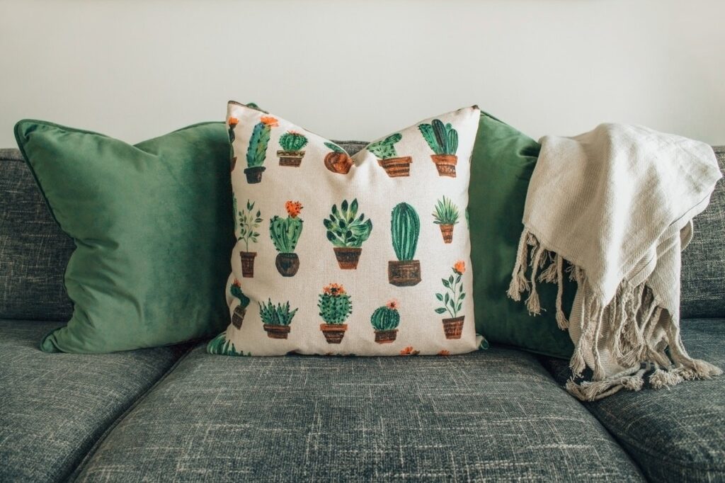
Even interior design has succumbed. There was a moment, around 2019, when every Airbnb in America seemed to be decorated with a woven wall hanging, a desert-toned rug, and a cactus silently bearing witness to a thousand bachelorette parties. The algorithm said beige was calming, and landlords obeyed. After all, neutral is universally rentable. Nobody complains about tan.
Historical cycles play a role, too. Minimalism has been one of the dominant visual movements for over a decade. We’re deep in the era of “clean girl” aesthetics, lifestyle optimization, and the fetishization of order. Our culture is exhausted; its response is smooth surfaces, empty whitespace, and graphics that whisper “don’t worry, this is under control.” Sameness becomes a balm.
Of course, the irony is that humans crave both comfort and novelty. We want the world to feel stable, but we also want a flash of surprise. That’s why a new brand with chaotic maximalist visuals can feel refreshing, even when it’s objectively ridiculous. It breaks the spell. It reminds us we’re still capable of perceiving difference.
Chaos Theory
But here’s the hopeful twist: homogeny is usually a prelude to rebellion. Design history is a pendulum, and it always swings back. The oversaturation of neutrals is already triggering a backlash: the return of color, texture, grit, handmade imperfection, and “unrefined” interfaces that feel alive. Designers are experimenting again. Brands are flirting with weirdness. The rising generation—raised on polished feeds—finds charm in the unpredictable.
Even the tools are evolving. AI design models, for all their quirks, are introducing visual diversity simply because they remix the inputs too aggressively to be neat. (Sometimes too aggressively. Sometimes with teeth where teeth should not be.) There’s a chaotic energy creeping back into the visual ecosystem, a reminder that creativity isn’t supposed to be tidy.
And as for us—the consumers, the scrollers, the reluctant participants in the Great Beige Merge—we’re developing a more discerning eye. Sameness is easier to notice now. Once you see the template seams, you can’t unsee them. And once you can’t unsee them, you’re more likely to value what breaks the mold.
So yes, everything looks the same right now. But only because we’re in the thick of an aesthetic bottleneck. And bottlenecks don’t last. They burst.
In the meantime, I take comfort in small rebellions: a messy collage layout, a garish vintage typeface, a kitchen painted an unreasonable color, a website that refuses to behave. If homogeny is inevitable for a while, at least we can puncture it with a little joyful chaos.
Sameness is soothing, but difference is what wakes us up.
